STUDIO
Imagine you want to apply for a grant. You are excited about your idea and the opportunity it could bring, but as soon as you open the guidance material, the excitement fades. The text feels heavy and technical, full of procedures and references to regulations. After hours of reading, you are still not sure where to begin. One applicant described it very clearly: “Understanding the consolidated regulation feels like rocket science.”
Some people will not even make it that far. A user once told us: “I did not apply for the grant after all, because I was unable to fit my case within the framework of the purchasing procedure.” Another admitted: “The purchasing procedure seems so complicated that I don’t want to deal with it. I’m afraid I will make a mistake.” Even those who try to follow the regulations and guidance often get stuck. They wonder whether the rules apply to their case and where to begin. One person said: “I did not know that a procurement procedure was required at all.” Similar concerns have also been voiced in relation to other legal texts, such as the terms and conditions of grant measures.
These stories reveal a deeper problem. The difficulty is not that people are careless or unwilling. It lies in how laws and regulations are written and turned into services. Specialists often rely on their own knowledge and context when preparing texts, because it feels faster and easier. But what makes sense to an expert can easily confuse the people who actually need to use the service. For many, navigating legal rules feels like entering a jungle without a map or a compass, not to mention a head net to avoid the stings from the bugs (allegory to the financial corrections pertaining to making mistakes).
In Estonia we have started to put these ideas into practice. Our aim is that every applicant, no matter their background, can quickly understand whether a grant is meant for them, how to apply, and what steps to follow afterwards. This is where legal design comes in. It brings design thinking into the legal field with user research: listening to users and understanding their frustrations, expectations, and needs. Based on these insights, documents, services, and processes are reshaped to meet user needs.
At the State Shared Services Centre (SSSC), which manages European Union funds in Estonia, we have begun to apply legal design systematically. Over the past two years we have worked with ministries, implementing agencies, and users in design sprints to rethink the way of working and creating services, legal acts, and information materials. In the following pages, we share two case studies where legal design and information design were used to transform complicated regulatory materials into clear and user-friendly guidance by using plain language, clear structure, and visual tools. These examples show how even small changes in design can remove barriers, reduce frustration, and make the grant application journey smoother and more accessible.
It all started when the service lead, while preparing the user agreement, admitted that even for her it was difficult to fully understand all the legal provisions. From the lawyer’s perspective, the contract was already reasonably well written (and short – only four pages). Yet together we came to the same conclusion: “We can do better.”
This raised a series of questions. Why are the service contracts needed? When and by whom are they read? Do the parties understand the provisions of the contract? These questions formed the problem statement when the team (Service Design Lead Lona Pärtel, IT Business Analyst Kriste Letta, and Lawyer Virge Pihel) began designing the SSSC’s first user-centric contract.
The focus was on the bilateral user agreement for the grants information system, which is typically signed with grant providers. The contract covers the service description, cost, standard conditions, and data processing and data protection aspects. The classic legal structure was information-heavy and difficult for users to grasp. The team’s goal was to understand which information was most important to the user, which was unnecessary and how much of the text was understood at all.
How users’ insights shaped design goals
The team selected six key individuals from the target groups related to the service contract. Interviews were conducted to understand the necessity of the contract, the usability and readability of the information, and the clarity of the process Interestingly, interviews revealed that the service provider (the SSSC) preferred a more general contract template, while the service user (implementing body) wanted all information consolidated in one place rather than being redirected elsewhere. It was also confirmed that the service provider had seen the contract primarily as necessary for disputes, whereas the service user’s main concern was a clear description of the provided service, its scope, and subsequent steps if the scope was exceeded. It became evident that, although standardization and specificity of conditions were most important to the service provider, the service user was uncertain whether they fully understood all applicable conditions. Admittedly, this uncertainty might have stemmed from the service user’s lack of an in-house legal advisor. Once again, the importance of plain language and information architecture when assuming obligations was highlighted.
The team defined three goals for the new contract:
- The service user reads and understands the contract terms, allowing them to focus on their core work.
- Information is easier and faster to retrieve, reducing confusion and disputes.
- Contract drafting is more efficient with reduced administrative burden, ensuring quality service delivery and smooth institutional workflow.
For prototyping the contract’s structure and information architecture, the team used the primary templates compiled in the WorldCC Contract Design Pattern Library[1] as a supporting resource. During the prototype phase, the team drafted contract terms following plain language principles, using a call-to-action tone. Icons reflecting the content were also designed to speed up navigation within the contract.
Testing confirmed faster and more accurate understanding
The team tested the prototype with users twice. In the first round, the team focused on testing the overall approach and revealed that both the visual and verbal elements needed improvement. In the second round the emphasis was on the comprehensibility of the entire contract text and how quickly users could grasp its content. Tests were conducted with lawyers, managers, and service users (a total of 15 tests).
The team used scenario testing to evaluate whether people could find and apply the right information. For example, in the first-round lawyers were asked what happens if the other party violates data protection rules and the dispute goes to court. Could the institution’s interests still be protected under the new wording? The lawyer walked through the document and confirmed that the remedies were clear, while also pointing out details that could be further strengthened. For a service user, the scenario was different: the 108 hours of service included in the contract had been used up. What should they do next? Who should they contact? In the original document, users often struggled to locate this information. In the redesigned version, test participants were able to find the answer much faster, navigating directly to the right section.
In the second round, the team tested more complex scenarios. For example, how should one proceed if the grants register required additional development work? Or under what conditions could service provider share contract-related information with third parties? Again, users were asked to describe how they found the answer, where they looked, and what caused confusion.
Control question answers from the second scenario testing were compelling. They showed that users found answers at least 50% faster in the information-designed contract compared to the original, and all answers were correct, while in the original contract some participants could not find the answers at all.
From the insights gained, the team made changes to the prototype (see Figures 1 and 2):
- The team removed repetitive, redundant clauses and content-empty words from the contract text, making the text more concise. Notable user test quote: “Suspiciously short contract—are all terms really included? At the same time, service provider’s participating lawyers in user tests did not feel that the institution’s interests were any less protected in the user-centric contract design compared to the original document.
- One of the interviewees, a lawyer, was amused when seeing the colourful version of the contract. At the same time, the interviewee pointed out that it is positive for the state to take the lead in such matters, since when both parties are public sector institutions, disputes remain within the system and can be resolved without court costs. This comment emerged during the prototype testing phase, where such reactions and feedback provided valuable insights for refining the prototype.
- Bringing key information and negotiated terms to the front page was beneficial. User test quote: “The first page contains the most important information for both parties.” User test quotes: “For organisations without lawyers, this is helpful,” and “The mind looks for loose ends—the fewer there are, the better.”
- While the original prototype used second-person plural sentences, test results favoured active voice, which clarified roles and correctness.
[1] World Commerce & Contracting, Contract Design Pattern Library https://contract-design.worldcc.foundation/ accessed 4 April 2025.
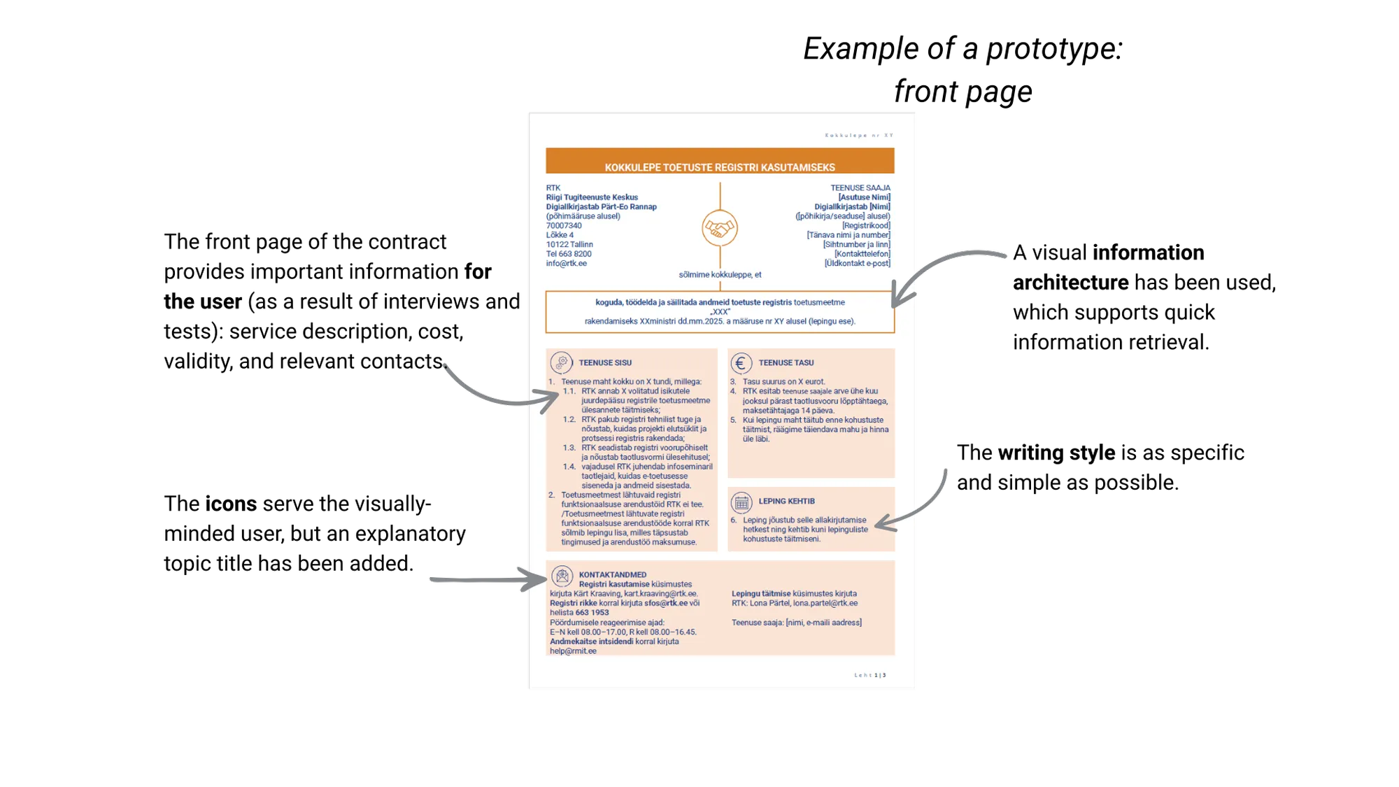
Figure 1. Example of the contract prototype’s front page
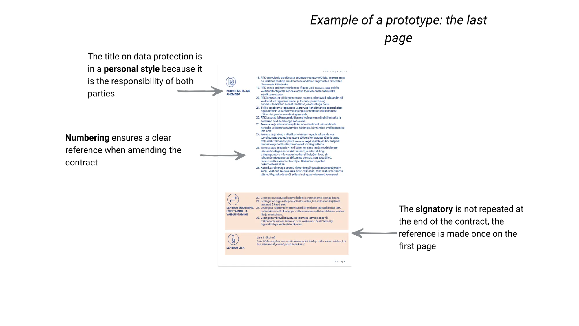
Figure 2. Example of the contract prototype’s last page
Why is a user-centric contract needed in the public sector
The greatest value is risk mitigation. For example, if data processing obligations for the information system are not understood and a risk materializes, liability and consequences largely fall on the system owner. On the other hand, the contract serves as a tool for information transmission, reputation building, process simplification, and delivering a better service experience. A telling user test quote was: “It would be ideal if the state led by example.” Today, this user agreement is already in use. Building on the experience, the same design approach is now being developed further in the context of grant decision acts. While this work is still ongoing, it shows how the lessons learned from one contract can gradually influence other legal documents in the grant system as well.
Procurement rules are one of the most confusing parts of the grant process. Many recipients do not even know they are required to follow a procedure. Those who do often find the guidance hidden on websites, written in dense language and difficult to use.
The SSSC procurement experts Piret Palts, Sandra Toim, and Elen Eigo-Aunbaum, Procurement Unit Manager Kersti Kukk, and Project Coordinator Maili Kallaste wanted to make the procurement procedure guide more understandable and therefore addressed the following issues in an existing guide during the sprint:
- The guide was too long and heavily written.
- Content was sometimes open to multiple interpretations.
- Grant recipients found it challenging to navigate procurement rules and might not understand what the legal text required of them.
- One guide for two different target groups—grant recipients and grant providers.
User feedback led to a rebuild instead of redesign
During the sprint, the team focused on designing an information-designed guide specifically for grant recipients so that the guide would precisely meet the most important target group’s needs. In fieldwork, the team conducted nine interviews with both grant providers and recipients. Interviews revealed that many grant recipients did not know they were required to follow purchasing procedure. Second, guides were not searched for where they had been placed on the website, and the search engine did not support finding the guide. Third, it was confirmed that the information in the previously used guide was unclear and difficult to locate for grant recipients. Therefore, the goal was set to create a step-by-step guide rather than legal explanations—a guide that:
- Matches the knowledge, skills, and experience of the target group.
- Has a logical and clear structure.
- Includes real-life examples and practical explanations (“what happens if you don’t do this?”).
- Is written in clearer language.
The team created five prototypes, one of which was selected and tested again with the same nine interviewees. To assess comprehensibility more thoroughly, the team also used scenario-based questions, asking participants to solve realistic situations and explain how they found the answers in the text. User tests showed that purchasing steps needed to be sequenced so that users could more clearly understand actions and their order. Based on the tests, the text had to be made even simpler and more segmented. Users found that opening frequently asked questions and practical examples after each topic helped to better understand the conditions.
Notably, as a result of adaptation to users’ needs, the guide expanded from six pages to 61 pages. However, thanks to segmentation, simplicity, icons, tables, and diagrams, the guide became significantly easier to use (see Figures 3, 4 & 5). Quotes from grant recipients tested include:
- “This is just wonderful! Very cool and bravo!”
- “The document is easy to understand, and each chapter is constructed using the same methodology.”
- “Compared to regulations or fact sheets, the text is visually more engaging, segmented, and easy to follow.”
- “Icons used in the guide are logical and make usage easier.”
- “Frequently asked questions by topic following each chapter are much better than a general FAQ at the end that groups all topics together.”
- “You have done a really great job. I read these golden rules with interest right away. I really like the examples and the FAQ. You learn more from these than just reading some theory. At first, the guide seemed intimidatingly long, but in reality, there’s a lot of white space and the information is well-structured, so it’s not in tiny print like a book. It’s very easy to quickly spot the parts that are important to you.”
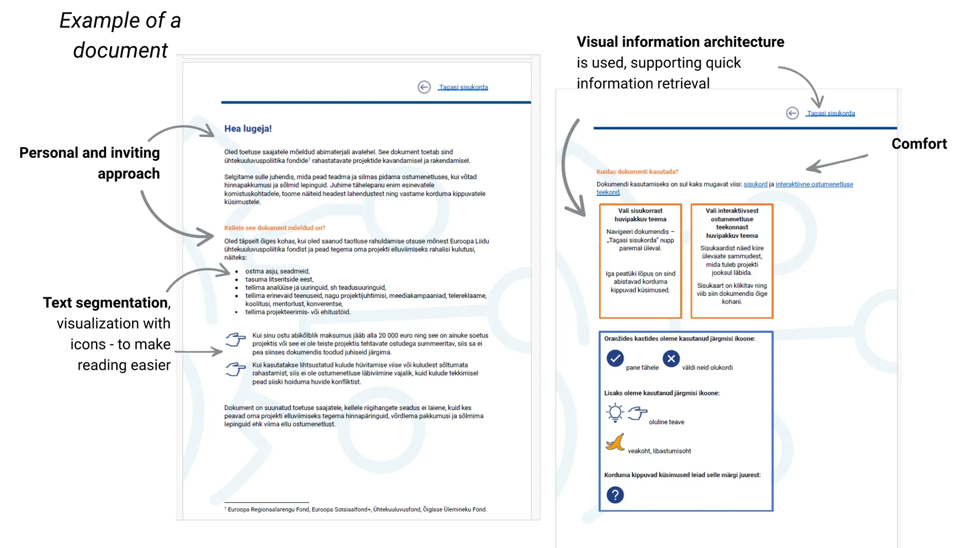
Figure 3. Example from the purchasing procedure guide “The Golden Rules of Buying” (1)
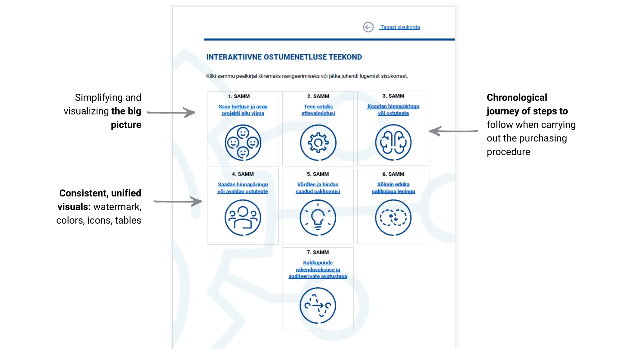
Figure 4. Example from the purchasing procedure guide “The Golden Rules of Buying” (2)
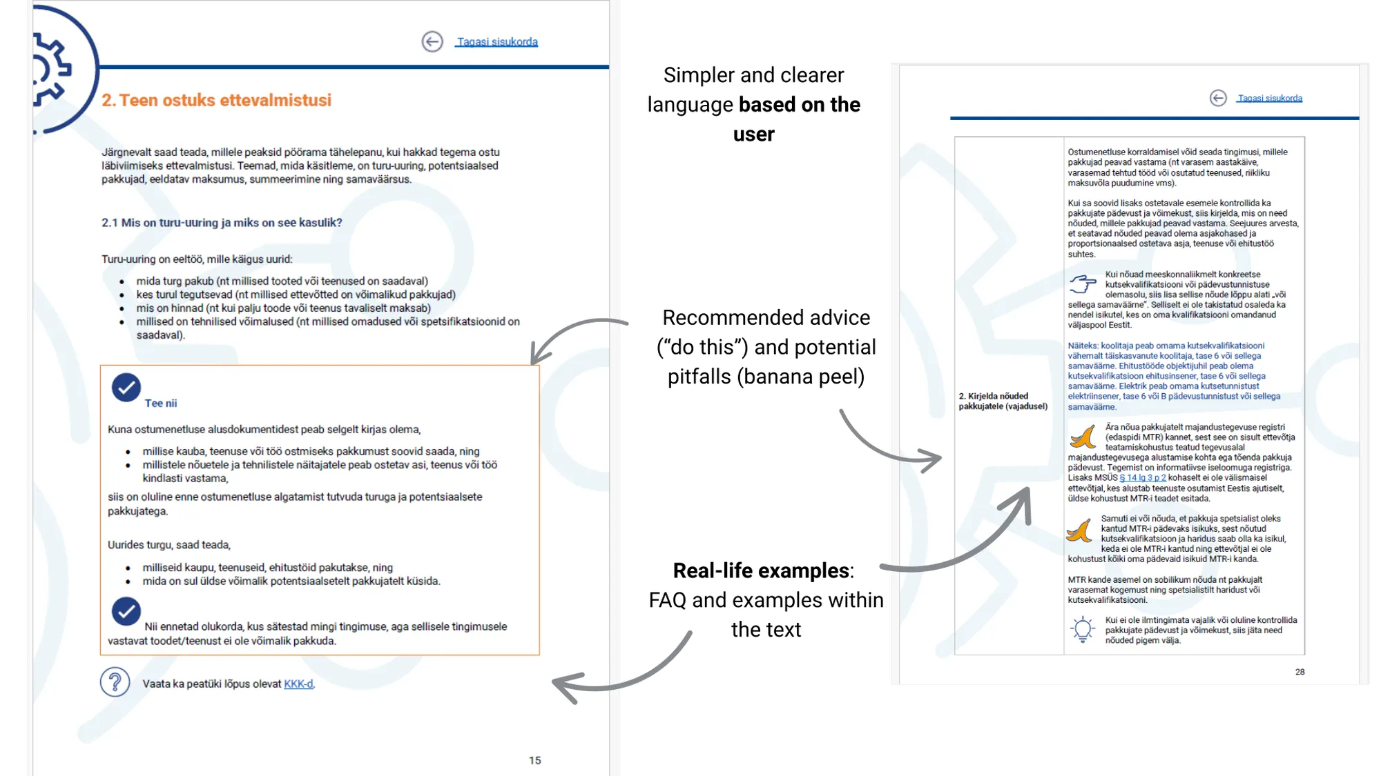
Figure 5. Example from the purchasing procedure guide “The Golden Rules of Buying” (3)
Why User-Centric Guides Matter for Grants
In the world of grants rules cannot always be changed. However, even if the rules can’t be changed, they can be made understandable. Very often these rules originate from several different regulations and are cross-referenced with one another, which makes them even harder for applicants to follow. In addition, established practices or existing interpretations may shift over time and can further influence how the rules are applied, adding yet another layer of complexity. At the same time the financial cost for making a mistake in the purchasing procedure can be severe for grant receivers. Moreover, people should feel confident and supported rather than lost or intimidated. As rules in the grant realm can often make people feeling overwhelmed and entail several risks of compliance, it is exactly where fieldwork such as user interviews, testing alongside with beginner’s mindset, and a desire to listen to the user can be a gamechanger. This helps create information that is clear, functional, and easy for users to understand and act on while also reducing errors and mitigating risks.
The two case studies are part of a wider effort at the State Shared Services Centre (SSSC), where a five-member grant measure design team now leads the systematic practice of legal design in the grants’ domain. Their mission is to make grant conditions, information, the application process, and administrative processes more user-friendly.
The Estonian grant system involves many actors: ministries draft grant measures, while implementing bodies such as the SSSC, the Estonian Business and Innovation Agency, and the Environmental Investment Centre distribute the funds. The design team supports both sides, working with around 400 public servants to bring user-centric thinking into everyday work.
One of the main tools of the design team is the legal design sprint, including thematic sprints for designing user-centric policies of grant measures, effective and efficient processes, and user-friendly information materials. The first information design sprint in 2024 focused on the information design of 2 information materials – one was procurement guide, and the other was information on a specific grant measure. User testing showed that redesigned texts helped applicants find answers faster, understand them better, and strongly preferred them to the originals. Encouraged by this, the team scaled up.
The second information design sprint stemmed from autumn 2024 to spring 2025. The 81 people in sixteen teams from nine institutions co-created 16 new user-friendly materials, from guides and contracts to websites and social media posts. Participants first interviewed users to learn about their pain points, frustrations, expectations in finding and using the information materials. Then they learned about plain language and information design principles including the 8-step guide to user friendly guide (see Figure 6). The teams created prototypes and tested them on users as part of the design process (see Figure 7). Many of these information materials are already in use, while others are being refined further[1].
[1] See examples of all 16 information material designs at the following link: https://www.canva.com/design/DAGqzFMw0cQ/13WY0tlWi5gObt6vCHh56w/view?utm_content=DAGqzFMw0cQ&utm_campaign=designshare&utm_medium=link2&utm_source=uniquelinks&utlId=haf8bade899
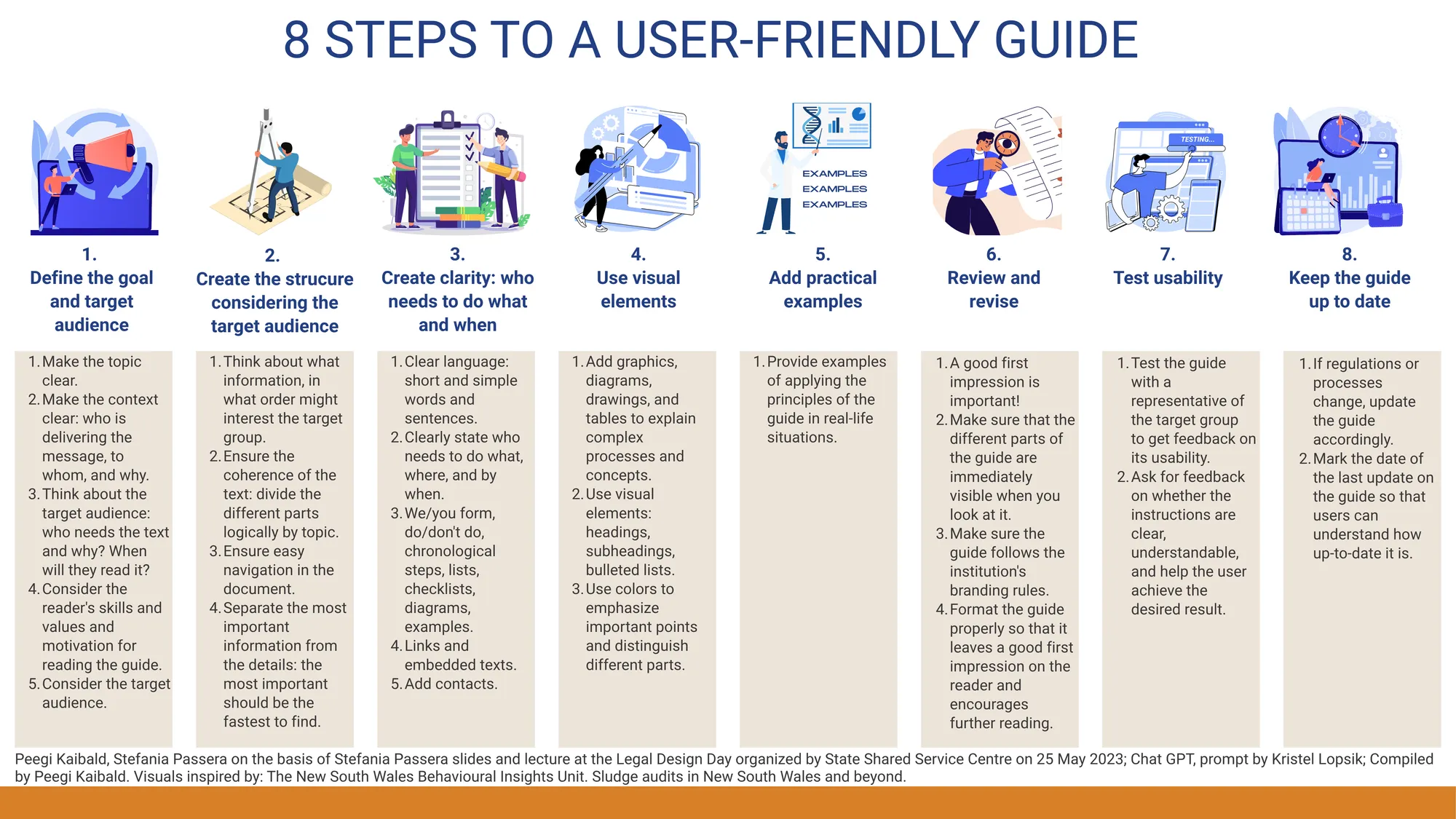
Figure 6. Eight steps to a user-friendly guide
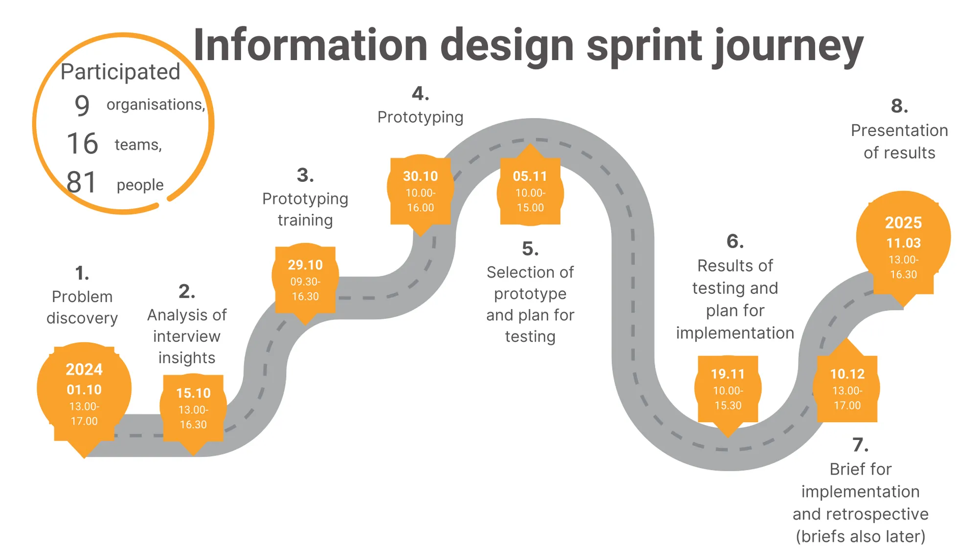
Figure 7. The timeline and process of the SSSC’s 2nd information design sprint from autumn 2024 to spring 2025
The aim of the SSSC design team goes beyond improving individual documents or services. Each sprint gives more people first-hand experience in designing with users, creating ripple effects across the grant system. Step by step, this is how legal design is making grants clearer, fairer, and easier to navigate.
The SSSC design sprints have shown that everyone has a designer within. The essential step? Just start (see Figure 8). In fact, everyone can do it: just talk to users, listen carefully, use the insights in your development process, and test your ideas to create the best possible solutions. Together with users, we made it through the legal jungle – and survived. Even the lawyers. And we are willingly embarking on this journey again and again.
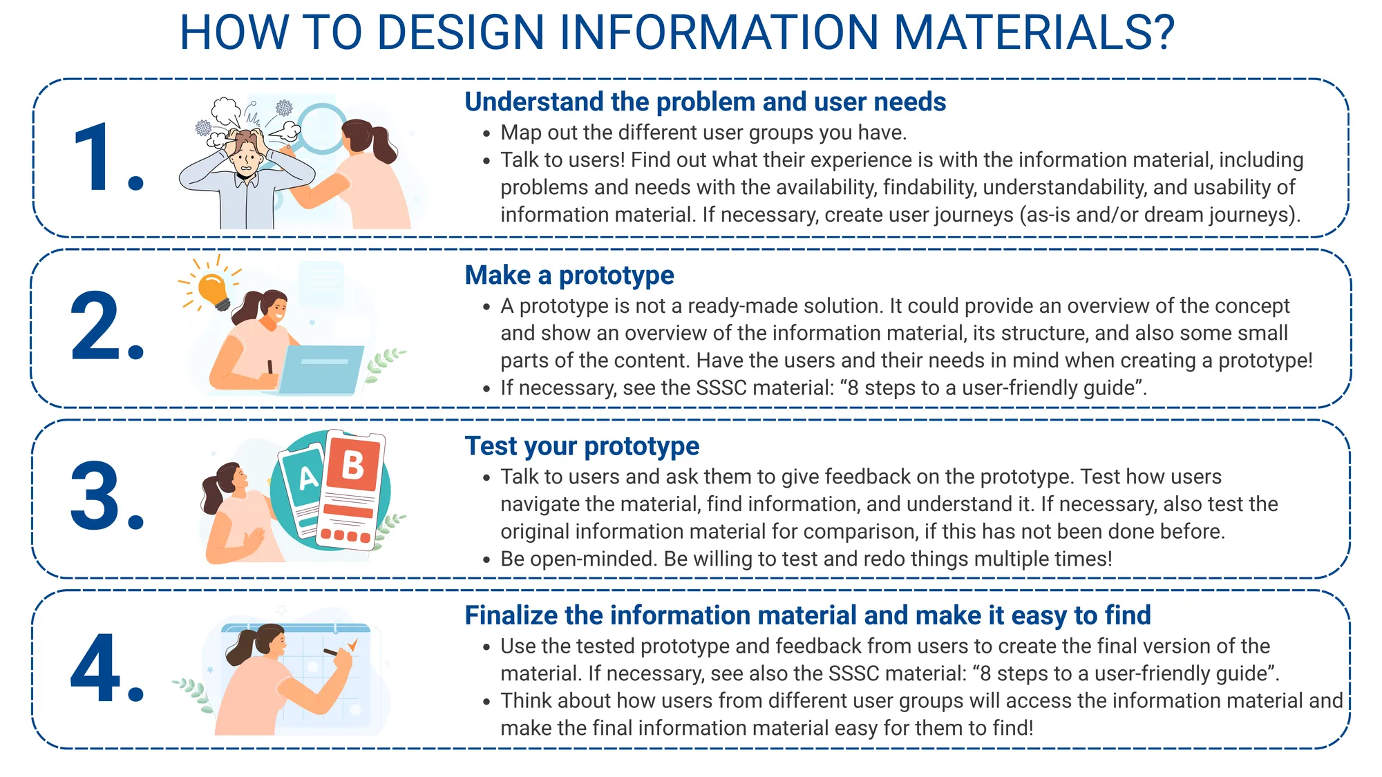
Figure 8. How to design informational materials?
Download this use case now.
Call for Submissions!
Submit your Legal Design story.
Issue 3
We will soon be receiving submissions for Vol. 3 of the Journal!

Do you want to share your Legal Design Story with the world?
Everyone can submit a use case for review by our expert team.
Here’s how.
How does it work?
We are looking for different kinds of use cases out of different phases of a legal design process.
This part of the Journal will showcase the best work and developments in legal design. This can be in the form of text, digital artifacts, reports, visualisations or any other media that we can distribute in a digital journal format. Text submissions can be between 1,000 and 5,000 words and are reviewed by our Studio editorial team.
What kind of practical use cases can I submit?
Your submission should consist the following:
- Challenge: Describe the problem you had to solve
- Approach: Describe the selected design process and phases you went through in order to solve the challenge. Please insert also a section of the impact that your concept will bring or brought.
- Solution: Show us the solution you developed. Not only with words but with images.
Make sure you do have permission and the rights to share your project an materials (such as images and use case stories etc.)
Why is there a review process?
How does the review process look like and how do we select use cases for publication ?
- Aesthetics
- Depth of concept (Why, What, How)
- Process steps you selected
- Impact
What are the requirements for submission?
Please find a list of requirements and tips here.
Do you want to share your Legal Design Story with the world?
Why publish with us?
Reputation
The editorial teams are comprised of many of the leading legal design academics and practitioners from around the world.
Diamond open access
We are a diamond open-access journal, digital and completely free to readers, authors and their institutions. We charge no processing fees for authors or institutions. The journal uses a Creative Commons BY 4.0 licence.
Rigour and quality
We are using double blind peer review for Articles and editorial review for the Studio. Articles are hosted on Scholastica which is optimised for search and integration with academic indices, Google Scholar etc.
Your Studio Editorial Collective
Do you want to see more use cases ? Take a look at the websites of some of our Studio editorial team.

