
STUDIO
Can administrative decisions actually work?
Lessons from a real-world pilot in Estonia
submitted by Peegi Kaibald
When reading a grant decision creates more confusion than clarity
Consider a typical scenario: you are an entrepreneur, an NGO, a national or local government institution, or simply an individual with a plan to make something happen. Perhaps you need new equipment, want to renovate a community center, organize training courses, or install solar panels on your home. To implement your plan at the required scale, you need funding.
You find a suitable grant, study the rules, submit a lengthy application, and wait. Eventually, the long-awaited notification arrives: your application has been approved.
Eager to see what happens next, you open the grant decision. Two and half pages of dense black-and-white text appear, beginning with references to legal acts that are not immediately meaningful. By the third paragraph, you finally realize that you have been granted the requested amount.
You keep reading to understand what to do next. Each sentence introduces a new obligation, yet what these obligations mean, and how to fulfil them, remains unclear. Instead of explanations, the text refers you to other sources and legal provisions. The number of references is overwhelming: nine legal acts and six additional sources.
At this point, you try to continue reading, but soon give up. You sit and sigh (quotes from interviews[1]):
- “Does every grant recipient need to have a lawyer by their side?”
- “It made me question myself – am I really that stupid if I don’t understand this? The very beginning was so intimidating that I felt like giving up.”
- “I don’t want to keep reading because it makes me feel very stupid.”
- “Honestly, I’d rather not take the grant at all!”
The initial sense of lightness quickly gives way to concern. You begin to question yourself, feel the need to seek help, and become discouraged.
[1] Quotes from interviews conducted during the testing of the decision as part of the Letter Hackathon
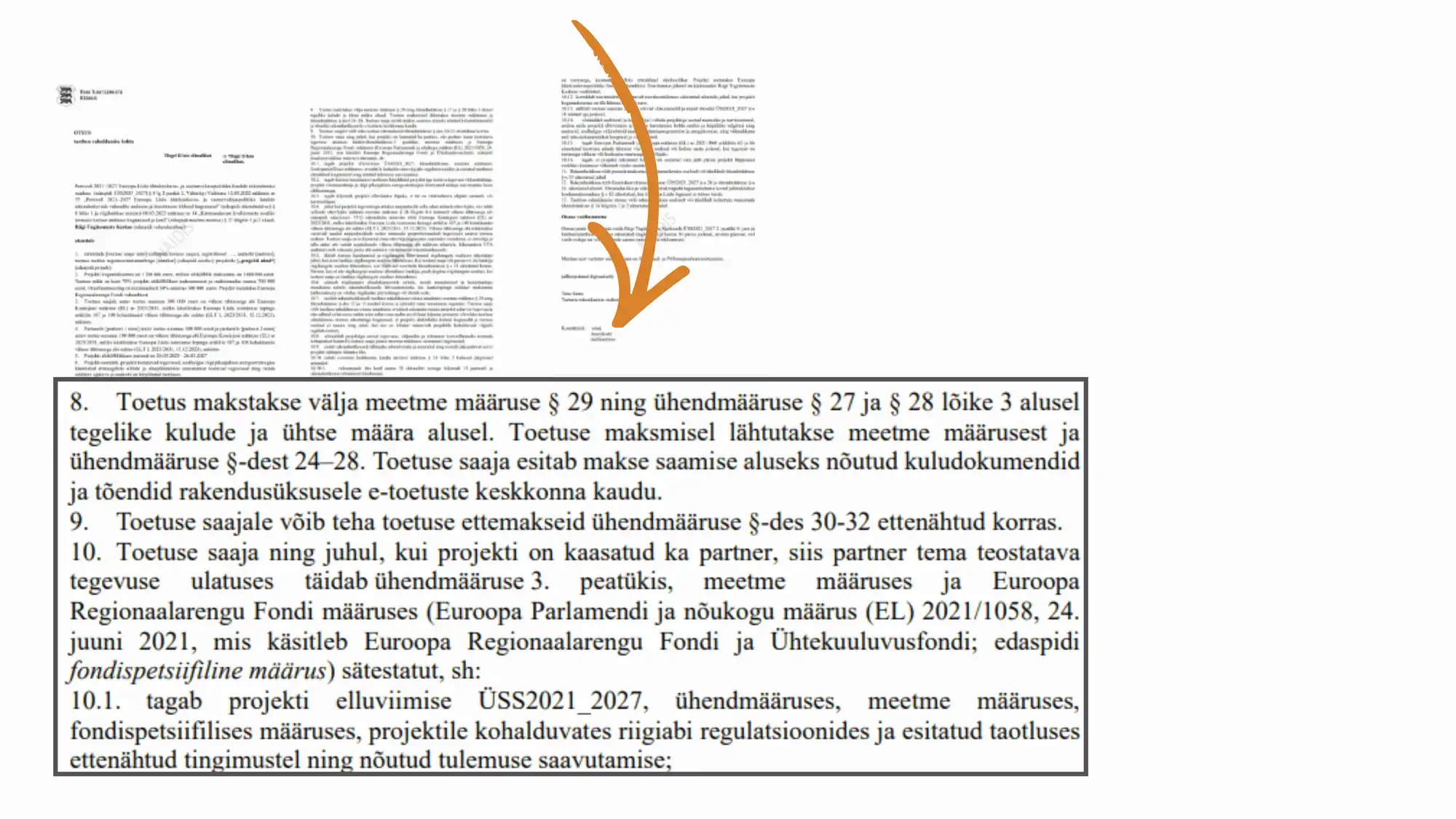
Figure 1: The initial grant decision
This raises the question: must a grant decision, i.e., a legally binding administrative decision[1] inevitably be complex and difficult to understand, or is it possible to design one in such a way that it is both legally precise and genuinely helpful for the recipient?
This is exactly what was piloted in Estonia at the Estonian State Shared Service Centre (SSSC, RTK in Estonian), where, within a specific grant scheme, the entire content and form of a grant decision were fundamentally rethought.
The initiative was sparked by the first Letter Hackathon organized by the Estonian Government Office Innovation Team in spring 2025, with the aim of making official communication in public authorities clearer. Enthusiastically encouraged by Lona Pärtel, Head of the Service Design Unit, the SSSC service designer Peegi Kaibald and senior legal expert Anu Jaanson joined forces and entered the initiative with an ambitious goal: not merely to improve a letter, but to redesign a legally binding administrative decision that would help grant recipients understand their obligations, avoid mistakes, and successfully implement their projects.
While the Letter Hackathon provided the spark, the choice to redesign the grant decision was rooted in a much older challenge: for years, lawyers and grant experts had observed that grant decisions often functioned more as a shield for the authority than as a source of guidance for the recipient, leaving recipients uncertain about what was expected of them and how to comply with the conditions attached to the funding. Yet, although the topic had surfaced repeatedly in informal discussions over the years, no one had attempted a comprehensive redesign of the decision. No clear owner had emerged, and the idea of redesigning a legally binding administrative decision had generally been considered too ambitious or too risky. The Letter Hackathon provided an opportunity to put this idea to the test and explore whether a grant decision could serve not only as a legal safeguard for the authority, but also as a practical guide for the recipient.
Measure twice, and cut once
The Letter Hackathon took place over two days spread across several weeks and followed the principles of design thinking. During the process, two grant decision prototypes were developed and tested along with the original grant decision through nine in-depth user interviews. The selection aimed to include people with as diverse backgrounds as possible in order to capture a wide range of perspectives. The interviewees included former grant recipients (4), individuals with no prior experience with grants (2), and managers and ministry officials from the grants field (3), for whom the interviews also served a communication purpose.
To compare the three versions, interviewees first reviewed the original grant decision, followed by the two prototypes. After each version, they answered questions about clarity, usefulness, and overall impression. In addition, interviewees were asked to complete two scenario-based tasks to gain further insight into how they navigate and interpret information in the different versions of the grant decision. A particular strength of the interview method was that interviewees reviewed the grant decisions during the session while sharing their screen and verbalising their thoughts. Observing where they hesitated, became uncertain, or misinterpreted information helped identify specific topics that required clearer explanations and additional guidance in the redesigned decisions.
The findings were clear. None of the interviewees preferred the original grant decision. It became evident that the original decision generated considerable confusion: readers struggled to understand the content, felt overwhelmed by the extensive legal references instead of explanations, and in several cases expressed a desire to stop reading altogether. By contrast, the prototype that differed most from the original decision received the most positive feedback, with seven out of nine interviewees preferring it over the other versions.
Analysis of the interviews revealed a recurring insight: people were not looking for a merely legally correct decision. They needed a document that would help them navigate the grant implementation process, understand what was expected of them, and quickly find relevant information when questions arose, rather than having to search through numerous legal acts and regulations referenced in the decision.
The interviews also revealed that the experience of reading and using the decision mattered. People were more likely to engage with a document that was approachable, clearly structured, easy to navigate, and understandable. When the document felt difficult to understand, interviewees felt they were discouraged from reading beyond the opening sections and would rather contact the administration directly for clarification.
These insights led the team to envision the future decision as a lighthouse for grant recipients. The lighthouse symbolized a grant decision that would guide recipients through their rights, obligations, and next steps, helping them stay on course throughout the grant implementation process while maintaining full legal accuracy as the grant decision is legally binding and gives rise to enforceable rights and obligations.
[1] According to § 51 of Estonian Administrative Procedure Act „An administrative decision is an order, resolution, precept, directive or other legal act which is issued by an administrative authority upon performance of administrative functions in order to regulate individual cases in public law relationships and which is directed at the creation, alteration or extinguishment of the rights and obligation of persons.”
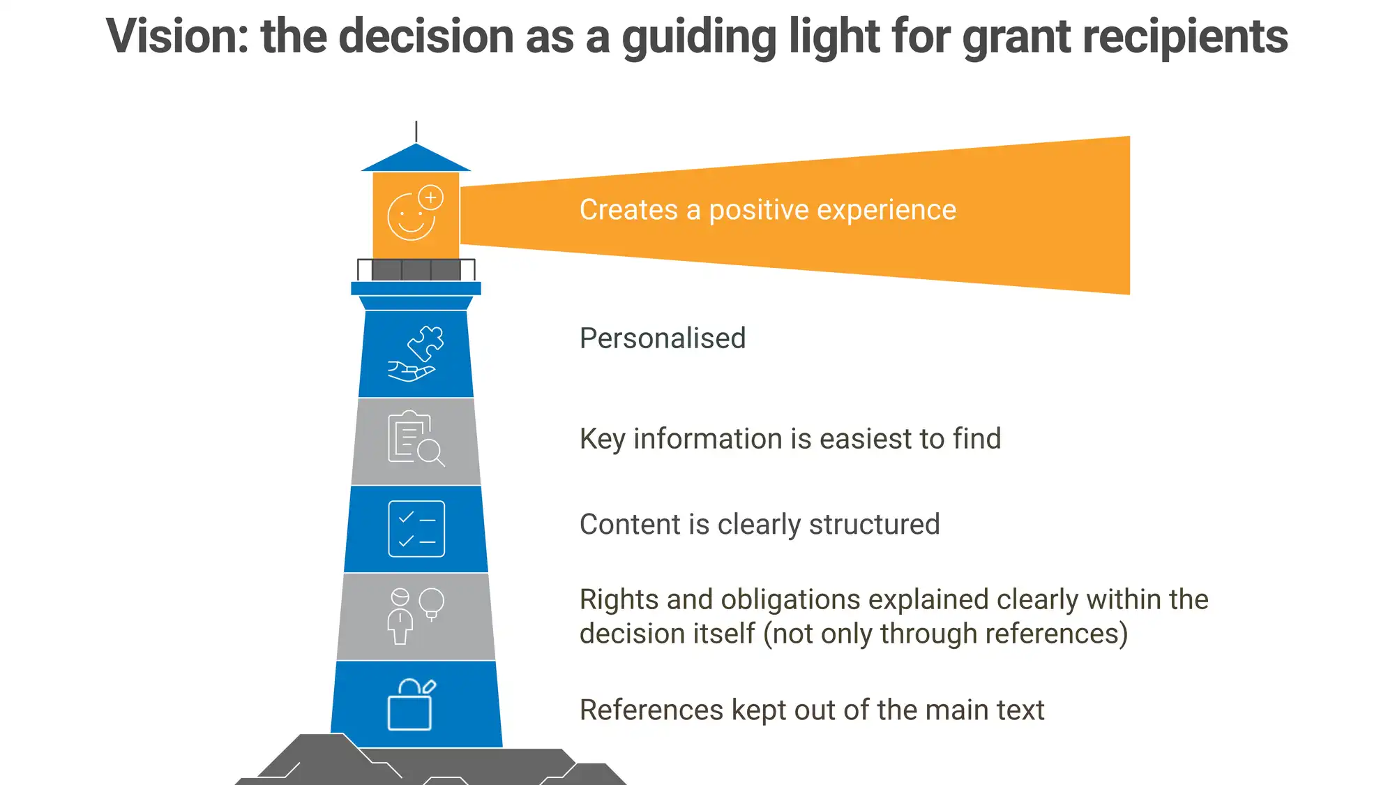
Figure 2: Vision emerging from the letter hackathon interviews: the decision as a guiding light for grant recipients
After the Letter Hackathon, it became clear that the initiative should not end at the prototype stage. Encouraged by the positive user feedback and insights, the team identified a grant scheme with an upcoming funding round and a highly motivated team willing to experiment with a new approach. With a suitable pilot opportunity in place, the team secured a mandate from management to continue the work and to pilot this new approach in real life in a concrete grant scheme.
The scheme selected for the pilot was the Just Transition Fund support scheme for regional initiatives implemented by the SSSC. It was well suited in terms of timing, as the grant decisions were not due to be issued until the end of 2025, leaving several months for co-creation, redesign, and testing before implementation. It was also a suitable context because the scheme supported development projects and capital investments for smaller organisations, such as NGOs, foundations, and other organisations whose day-to-day work may not typically involve applying for grants.
Rowing in the same direction: co-creating the pilot decision
During the piloting phase, several additional experts from the previously mentioned highly motivated team joined what had initially been an organically formed design team around the decision. The work was carried out not individually, but in co-creation, with the document written together in MS Teams sessions.
SSSC’s legal experts Marliis Elling and Anu Jaanson ensured legal accuracy. Service coordinator Terje Kuus and project coordinator Marina Bulatskaya provided insight into the practical processes of using the grant. Designer Peegi Kaibald led the design process and represented the grant recipient’s perspective in shaping both the visual design and the wording, while unit heads Kertu Sepp and Lona Pärtel provided leadership support throughout the process. A document management specialist, Margit Rei, was also involved to ensure that the new decision template could be implemented within the document management information system.
In drafting the text, different perspectives were taken into account, and feedback was also sought from international information design experts at the Legal Design Summit. In addition, different visual versions of the decision were tested with 11 people, and the wording with 4 people in the process. As a risk mitigation measure, all members of the SSSC’s legal team were also given a full month to review and comment, ensuring clarity and legal certainty.
Looking back, it is clear that co-creation and testing were crucial in overcoming “expert blindness” – a situation where everything seems self-evident to the drafter of an administrative decision, making it difficult to see the document from the grant recipient’s perspective.
What changed in the decision?
In structuring, designing, and developing the content of the new grant decision, the “lighthouse” vision served as a set of guiding principles.
Content and language
- All essential information is now included directly in the decision itself, and presented clearly in understandable language
First, care was taken to ensure that all legally required aspects, as well as all topics relevant to the grant recipient, were reflected in the new decision. The content was structured from the perspective of the grant recipient, following a logical chronological order as much as possible. For each topic, previously raised questions from grant recipients were revisited, asking: “Which aspects of this topic typically cause confusion, and what does the grant recipient absolutely need to know?”
Compared to the original grant decision, a fundamental shift was made: instead of merely referring to provisions of legal acts, all topics were now explained in the grant decision itself. The wording aimed to be as precise and unambiguous as possible, and each sentence was tested against the question: “Is this information enough and would a first-time grant recipient in this field truly understand this on the first reading?”
Throughout the process, plain language served as a guiding principle ensuring that the target audience can easily find the necessary information, understand it, and act on it.[1]
- The reader is addressed directly
A friendly tone and addressing the reader directly were used throughout the text, shifting away from the previous impersonal style towards something closer to practical guidance. Where elements were advisory rather than mandatory, this was explicitly indicated. To reduce the sense of intimidation for the grant recipient, a more direct and less formal tone (“you”) was used, although the use of “you” was kept to a minimum wherever possible by relying on verbs instead.
- Bullet points are used to improve readability
The content of the decision was presented in bullet points to make it easier to grasp. Bullet points were chosen instead of the previously used numbering primarily because the information does not represent a sequence for the grant recipient. The aim was also to create a friendlier tone, with bullet points perceived as more approachable than numbering.
- References to legal acts were moved to footnotes and provided also as links
All references to legal acts were retained, but they were moved to footnotes at the bottom of each page. Each reference now also included a direct link to the relevant legal act and, where possible, to the specific provision. To ensure that references remain accurate over time, they were set to point to the currently valid version published in the official portal of Estonian legislation, which automatically directs users to the up-to-date version even when changes occur.
[1] EKI. https://eki.ee/teatmik/mis-on-selge-keel/ and Plain language — Part 1: Governing principles and guidelines) (Plain language — Part 1: Governing principles and guidelines)
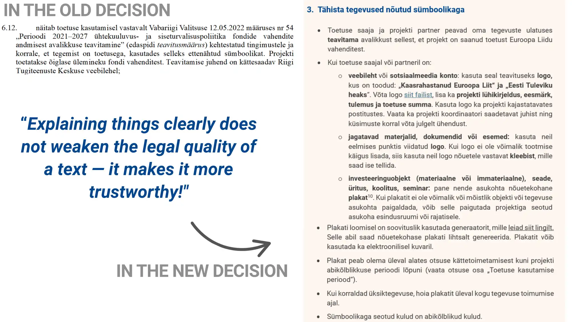
Figure 3: An example of language use in the original and the new decision
Design and structure
- Visual language is based on the organization’s style guide and previously tested solution
The design of the decision followed SSSC’s visual identity guidelines in order to maintain consistent visual language across the organization. In selecting design elements, the team drew on the design of an innovative user-centred service agreement developed in a previous SSSC information design sprint. The core design elements and color palette had already been tested with users during that process, and the aim was to maintain a consistent visual style within the organization.
- Topics are now clearly structured and visually distinguished
The content of the decision was organized by topics, and the structure aimed to follow a logical sequence of activities from the grant recipient’s perspective as much as possible. To make the structure easier to grasp, each section was given a distinctive heading using a larger font, a different color, and a corresponding icon. A subtle orange background box was added under each topic to help readers quickly identify where one topic ends and the next begins. The background color was chosen based on the service agreement’s color palette and principles of color theory, with the aim of making the document more visually appealing, encouraging engagement, and reducing the sense of overwhelm caused by the document’s length and complexity.
- Key information is now easy to find
The first page of the decision was intentionally designed as a clear and uncluttered overview. The most important information – the name of the grant recipient, the project title, and the funding amount – was highlighted in a separate box for visibility. As the decision became significantly longer due to expanded explanations (growing from two and half pages to eight), a visual table of contents was also added to the first page.
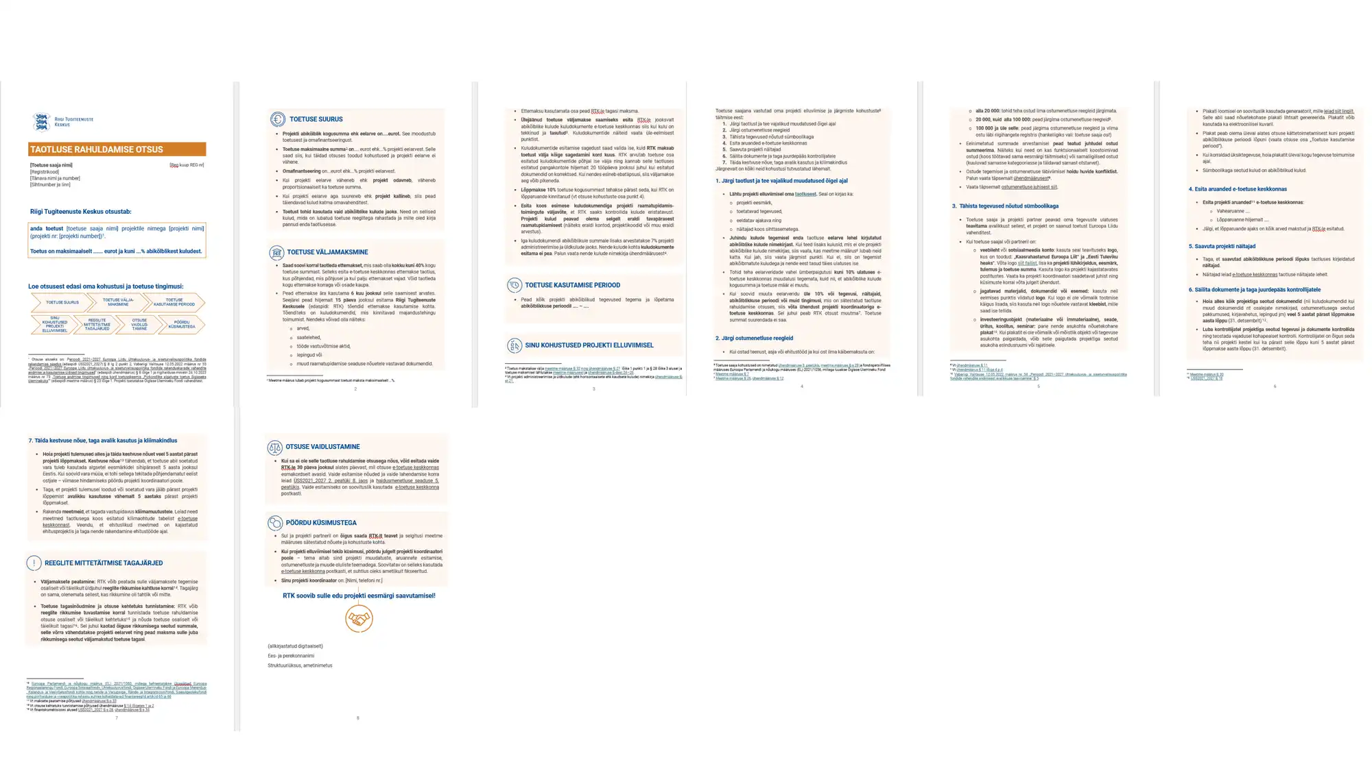
Figure 4: Full version of the new grant decision (prepared by: Anu Jaanson, Terje Kuus, Marina Bulatskaya, Marliis Elling, Peegi Kaibald)
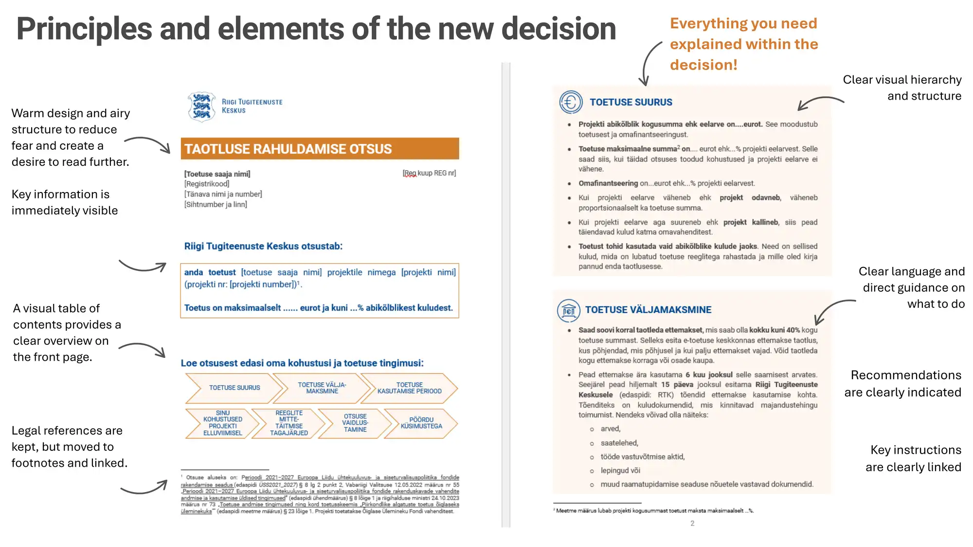
Figure 5: Detailed view of the first two pages of the new grant decision and description of the design choices (prepared by: Anu Jaanson, Marliis Elling, Terje Kuus, Marina Bulatskaya, Peegi Kaibald)
Traditionally, administrative decisions are black-and-white documents with dense text, characterized by formal legal language and numerous references to legal acts. To the best of the SSSC grant decision design team’s knowledge, administrative decisions in Estonia have not previously been designed in such a way that both the visual design and the way the content is presented throughout the entire document – including language use and referencing – have been fundamentally rethought to this extent.
Therefore, this was not a matter of cosmetic adjustments, but a comprehensive redesign pilot extending beyond grant decisions to the broader landscape of administrative decisions in Estonia.
As a result, the design project also became a significant change management effort, requiring a departure from established ways of working. In retrospect, achieving a shared shift in mindset and the willingness to experiment together proved to be both the greatest challenge and the most valuable outcome of the project, as this shift extends beyond the project itself.
Given the novelty of the approach, the SSSC grant decision design team also assessed potential risks before piloting the new type of decision. No violations of formal requirements were identified, and additional reassurance came from the understanding that even if minor formal deficiencies were present, this would not automatically render the administrative decision invalid[1].
As administrative decisions issued by public authorities in Estonia are subject to the Government Office’s guidelines and templates[2] on state visual identity, an exception was requested from the Government Office to pilot the new type of decision.
Taking into account that the current templates for administrative decisions have been in use for a long time, that people’s information consumption habits have changed significantly over the past decade, that practice is the ultimate test of validity, and that reducing administrative burden is a shared responsibility across public authorities, the aim was for the pilot to also provide valuable insight into how the needs of recipients of administrative decisions are evolving overall.
The SSSC grant decision design team is very grateful to the Government Office for enabling this pilot, as only through collaboration and experimentation is it possible to truly understand the impact of such changes and to explore how administrative decisions can be made more user-centric.
While the pilot focused on a single grant decision, its ambitions extended beyond one document. The findings and lessons learned were shared with the Government Office’s Visual Identity Team, which is responsible for developing and maintaining document templates across the Estonian public sector. By combining user feedback with impact measurement, the project contributes initial evidence on how legal design can be applied to legally binding administrative decisions. The team hopes that these findings will encourage broader experimentation and support future improvements in the design of administrative decisions across government. There are still some boundaries to push.
[1] Estonian Administrative Procedure Act § 55 ja § 58 Haldusmenetluse seadus–Riigi Teataja
[2] Government Office of Estonia. Visual Identity Guidelines. Valitsusasutuste visuaalse identiteedi stiilijuhis | Riigikantselei
What did the grant recipients think?
The new type of grant decision was delivered to recipients at the end of 2025. There were 13 grant recipients in total, and to gather feedback, the team conducted in-depth interviews with all of them in January 2026. In addition to the redesigned decision, and following the recommendation of the Government Office, feedback was also collected on an alternative version with a blue color scheme, as well as on the original, non-designed decision that would otherwise have been used.
All grant recipients had previously received grant decisions either from SSSC or from other public authorities, which enabled them to compare the new decision with the traditional grant decisions based on their prior experience. The interviews resulted in several insights, of which the six main ones are summarized below.
Insight 1: length does not determine usability – what matters is how easily the information can be grasped
The responses of grant recipients revealed that a grant approval decision is not merely a document, but both an emotional moment and an immediately actionable task. For this reason, the decision must be clear, easy to understand, and support the user in taking the next steps.
When opening the decision, all grant recipients experienced positive emotions. Most commonly, they described feelings of satisfaction, surprise, and appreciation, noting that the document was user-friendly, modern, and different from the official decisions they had seen before.
In terms of reading behavior, about half of the grant recipients read the decision from start to finish, while the other half scanned it first, looking for the information most relevant to them.
Although the decision had grown from two and half pages to eight, its length was not perceived as a problem. Thanks to the design elements, finding information became faster, understanding the text easier, and the overall document significantly more accessible and functional. This made it possible to locate key information, such as the grant amount, payment conditions, obligations, and reporting requirements, quickly and with minimal effort.
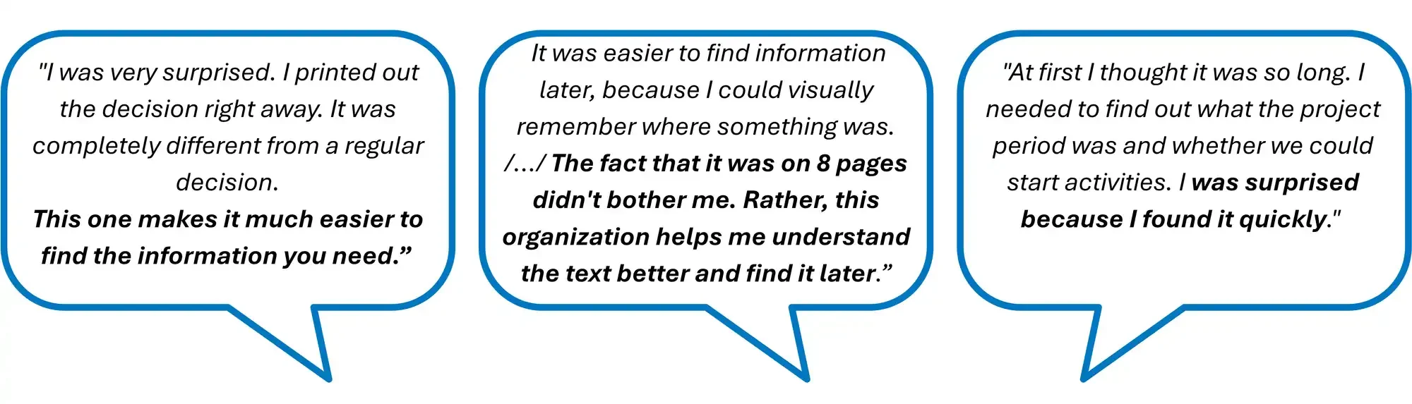
Figure 6: Quotes from interviews with grant recipients
Insight 2: ease of grasping the information is shaped by clear structure and visual design
Grant recipients consistently described the content of the decision as clear, easy to understand, and logically structured from the outset. Alongside language use, the visual structure was perceived as one of the key strengths of the decision.
Figure 7: Quotes from interviews with grant recipients (2)
Seven out of the thirteen respondents noted that all of the content and design elements should be retained. In addition, respondents highlighted several aspects that were particularly important for them: grouping the content into sections (4), the visual table of contents (2), plain language (1), icons (1), and the use of bullet points (1).
When evaluating different visual aspects of the decision separately, it emerged that the overall design and the key information box on the first page supported understanding for all 13 grant recipients. Bullet points in the text were helpful for 12 recipients, icons and the colored background for 11, and the numbering of obligations and the visual table of contents for 9.
Most grant recipients did not find anything confusing, distracting, or redundant in the design. It was considered clear, user-friendly, and supportive. Only one respondent noted that the illustration on the first page was somewhat confusing, as the arrows appeared to suggest a chronological sequence.
Out of the 13 respondents, 11 preferred the bullet-point format over numbering, one indicated no preference, and one preferred numbering. In the case of icons, their presence was helpful, although the specific design of the icons themselves was not always considered essential.
Insight 3: clear and natural language, together with sufficient information, enable understanding and action
The language used in the decision – an explanatory style that clarifies the grant recipient’s obligations, a direct and more informal form of address (“you”), and text framed as concrete action steps was perceived by recipients as mostly natural (9), supportive (7), friendly (3), and easy to understand.
Two respondents noted that it felt formal, while another two found that it struck a balance and was neither overly formal nor too informal.
This approach worked well for both experienced project managers and first-time applicants, and conveyed the sense of a human, rather than overly bureaucratic document.
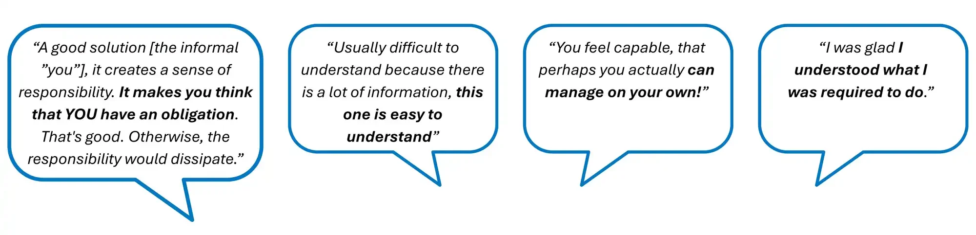
Figure 8: Quotes from interviews with grant recipients
The use of the more informal “you” form was perceived positively by half of the respondents and neutrally by the other half. There were no objections and some respondents did not even notice it. On the positive side, it was noted that addressing the reader directly creates a sense of responsibility and a feeling of obligation for the grant recipient. It also makes the document less formal, reduces distance, and feels friendly and supportive.
During the drafting process, there had been some concern among the team that this type of explanatory, guiding, and directly addressed style might come across as too informal. However, this concern did not materialize: none of the grant recipients considered the text overly informal, and the language and content were highlighted as one of the strongest aspects of the decision.
It also emerged that all grant recipients preferred references to legal acts to be presented as footnotes rather than embedded in the main text, as this made the decision easier to read, reduced visual clutter, and did not interrupt understanding. Most grant recipients (12) did not open the referenced legal acts in the decision, as they felt that the necessary information was already presented clearly and comprehensively within the document. The fact that references were linked, and often directed to the relevant provision, was also seen as a positive feature.
Insight 4: improving language alone is not enough – a holistic solution is essential
During the interviews, grant recipients were also shown an alternative version of the grant decision using a blue color scheme. The text was identical, but the visual design was more restrained: the only color used was blue, there were no light orange background boxes, and the overall background remained white.
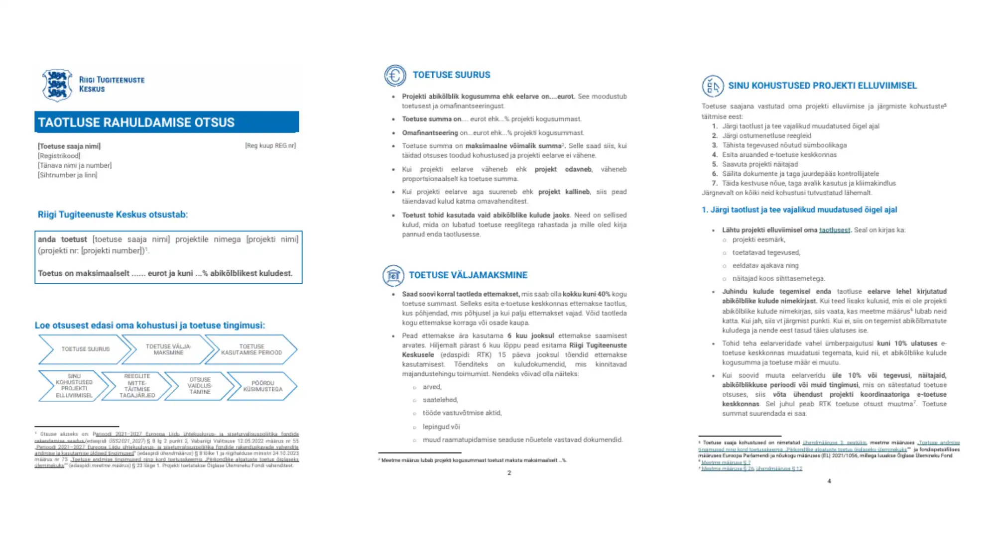
Figure 9: Alternative design not used, but shown during the interviews: a grant decision with a blue color scheme
The results showed that 9 out of 13 respondents preferred the version sent by SSSC over the blue version. Two respondents said there was no difference for them, although they still considered some background color important, and two said it made no difference at all. None of the respondents preferred the blue version. It was also noted that the use of orange added a sense of warmth and reduced distance (2), whereas blue was perceived as colder and more formal (1).
This indicates that it is not sufficient to make the wording clearer alone as the visual design also plays a key role, forming a coherent whole together with language.
Insight 5: a user-centred approach – combining clear structure, visual design, sufficient information, and clear, natural language – significantly improves user experience
In addition to the blue version described above, grant recipients were also shown the standard decision template used in other grant measures, which they would have received if the redesign process had not been undertaken (see Figure 1).
The responses showed that all 13 participants preferred the new decision. The original version was described as tiring and difficult to read, overly formal, hard to navigate, and inconvenient for quickly finding information.
Interview findings indicated that, compared to the original grant decision, the new one was perceived as:
- much more convenient to use,
- clearer,
- more visually approachable and helpful in quickly understanding what needs to be done,
- not perceived as lengthy,
- well-structured and easy to navigate, saving time,
- highlighting key obligations directly through design (removing the need for recipients to mark them themselves),
- more usable for those with limited prior experience,
- more accessible for non-native Estonian speakers,
- less frustrating and overall “a breath of fresh air”.
These findings highlight the significant potential of information design to improve user experience.
Insight 6: a user-centred approach makes people feel capable of managing on their own and brings a sense of humanity to the experience
Feedback on the new decision was overwhelmingly positive. The SSSC design innovation was seen as positively surprising, innovative, and welcome. Users noted that they would not typically expect such simplicity and user-friendliness from public authorities. There was a strong preference for this type of decision format to become a standard rather than remain a one-off pilot. In addition to the decision itself, respondents also praised the overall application process, as well as the friendliness, accessibility, and helpfulness of the staff of the SSSC.
Reading the decision generated positive responses among grant recipients, creating a sense of confidence and reassurance. The document was perceived as clear, friendly, and user-oriented. It conveyed a sense of “I can manage this,” reduced fear of complexity, and immediately provided a practical direction for action.
It also became clear that the decision is part of a broader process that is experienced as a whole. The new form of the decision was perceived as approachable, accessible, and genuinely considerate of people, reducing formal distance and creating a clear sense that “SSSC speaks to me as a person.”
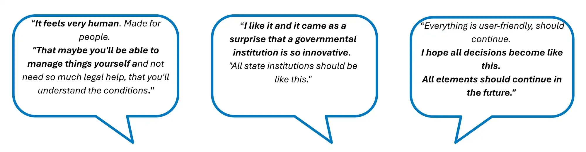
Figure 10: Quotes from interviews with grant recipients
Piloting confirmed that structuring the content clearly, using plain language, and applying visual design elements reinforce one another and are all essential for communicating information effectively.
Before the design process, the key questions for the team were whether the recipients would read the decision, whether they would understand it, and whether they would know how to act based on it. After the interviews, it became clear that the answer to all of these questions was yes. More than that, it also became evident that the redesigned decision did not simply add functionality, but it also brought in a sense of humanity that goes beyond functionality and reflects one of the broader aims of legal design.[1]
From user clarity to administrative efficiency
When grant recipients understand their obligations and know how to fulfil them, the burden on the grant provider is also reduced.
From an administration’s perspective, it became clear within the first weeks after sending out the decision that the new approach works. According to SSSC service coordinator Terje Kuus: “Previously, around 50% of grant recipients would call to ask how to apply for an advance payment. In this round, there have been no questions on this topic.” Moreover, Kuus anticipates a broader reduction in information queries: “On average, we receive about 17 calls or emails with questions per project each year. Based on the topics, I expect that, thanks to the new decision, this could decrease to around 12.”
The actual reduction in information queries can only be assessed retrospectively after the completion of the grant projects. However, if the projected decrease of 28% holds, the time invested in redesigning all new positive grant decisions at the SSSC would be offset within three months, as the texts of similar grant decisions are largely standardized (although this would require corresponding decisions within the SSSC, as well as changes to the Government Office guidelines and templates governing administrative decisions). In addition to looking into the number of information queries, the plan is also to analyze, after the completion of the projects, whether and to what extent the number of breaches and recovery claims of funds has also decreased.
It is, however, clear already now, that this experience provides a strong foundation for planning the next steps. The SSSC therefore plans to pilot the redesigned decision with a different target group and to pilot the same approach also to decisions with negative content – that is, decisions rejecting grant applications or recovering funds – in order to assess how well the approach works in different contexts before taking further steps.
[1] See also M. Kim, D. Jackson, J. R. Sievert. Legal design: dignifying people in legal systems. Cambridge, United Kingdom; New York, NY: Cambridge University Press, 2024.
Designated as a foundational research project, we aimed to explore the use of interactive design in the context of “legal” – how does a system have to be designed to provide a broader audience with access to law? Eight preliminary design principles emerged from our work:
-
In addition to the new pilot plans, it is important to highlight the shift in perspective towards co-creation and user-centredness within the administration. At the beginning of the process, legal experts had several reservations about the use of design methods, user testing, and the preservation of legal accuracy.
By the end of the project, however, those involved had reached a different conclusion. They found that clear and human-centred language does not have to come at the expense of legal accuracy and that co-creation offered much greater value than the traditional practice of passing documents back and forth between experts for review. Working together from the outset enabled shared problem-solving, brought different perspectives together, and generated solutions that would have been difficult to achieve alone.
The process also demonstrated that involving legal experts earlier can improve quality and help prevent misunderstandings, questions, and disputes before they arise. Rather than being called upon only after problems emerge, lawyers became active contributors in shaping solutions from the beginning.
Moreover, the pilot’s impact extended even beyond the redesigned decision. By participating directly in user interviews, co-creation workshops and testing activities, legal experts experienced first-hand the value of legal design methods and user involvement. This gave them confidence to lead workshops themselves, facilitate co-creation processes and experiment with clearer, more user-friendly wording in other projects. As a result, collaboration increasingly shifted from a model based on exchanging draft documents for review towards a more iterative and multidisciplinary way of working.
Beyond changing day-to-day ways of working, what began as participation in a single pilot project has evolved into a broader role. Today, the participating lawyers not only use legal design methods, but also act as ambassadors of legal design sharing their experiences within the organisation, across the Estonian public sector, and internationally.
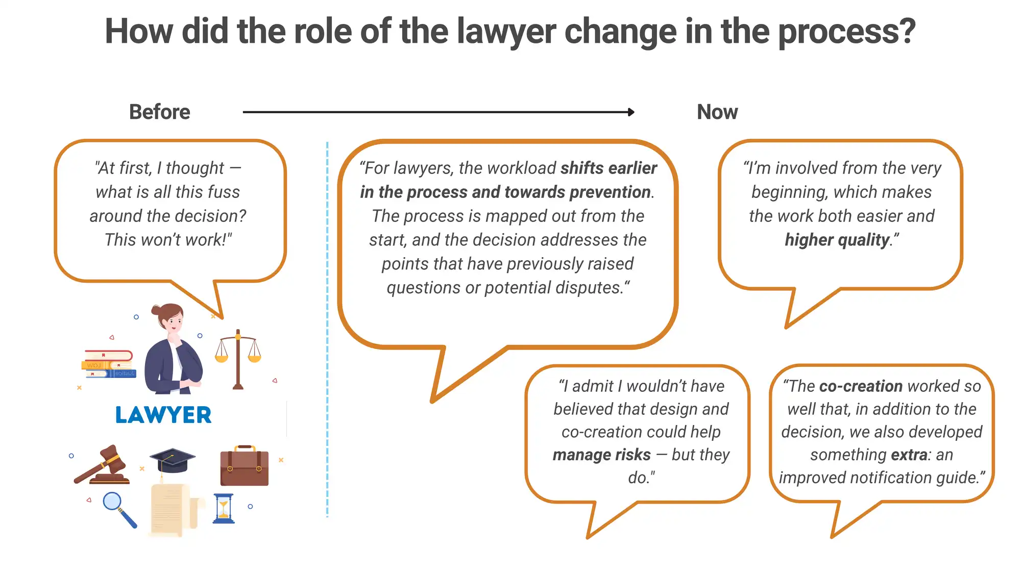
Figure 11: Quotes from SSSC legal experts/lawyers on the grant decision pilot process
Plain language does not happen by accident: change begins with a decision to act
Writing in plain language does not happen automatically. It requires a conscious decision and a willingness to act. For this reason, it is important that public authorities consistently prioritize plain language and integrate it as a natural “hygiene factor” in their work, rather than treating it as an occasional exception.
The first step is, in fact, very simple: before sending out a communication or an administrative document, it is worth pausing for a moment to consider whether the target audience will understand it and know how to act upon it. Where possible, it is also useful to have another person briefly review the text. At the same time, leadership support and direction are essential, ensuring that officials have the time and backing needed to genuinely integrate plain language into their everyday work.
The experience of redesigning and piloting the new grant decision demonstrates that there is no reason to fear experimentation or to approach things differently. It is worth stepping beyond the familiar “this is how it has always been done” mindset, taking a more complex text and, ideally together with colleagues, rewriting it more clearly, structuring it, supporting it visually, and testing it with users.
In the worst case, one realizes that this takes time: it is human to think and work from one’s own perspective and shifting that perspective requires some adjustment.
At best, however, one discovers that:
- it creates new opportunities for collaboration,
- even highly legalistic text can be transformed into clear and human language,
- writing clearly does not mean oversimplifying,
- nor does it reduce reliability or legal accuracy.
In return, one gains genuine appreciation from recipients, saves time through fewer inquiries and errors, and contributes to a public sector that is more caring, more accessible, and more human-centered.
Download this use case now.
Call for Submissions!
Submit your Legal Design story until June 30, 2026.
Next Issue of the LDJ
We are receiving submissions for Vol. 3 of the Journal!

Do you want to share your Legal Design Story with the world?
Everyone can submit a use case for review by our expert team.
Here’s how.
How does it work?
We are looking for different kinds of use cases out of different phases of a legal design process.
This part of the Journal will showcase the best work and developments in legal design. This can be in the form of text, digital artifacts, reports, visualisations or any other media that we can distribute in a digital journal format. Text submissions can be between 1,000 and 5,000 words and are reviewed by our Studio editorial team.
What kind of practical use cases can I submit?
We are looking for Prototypes or implemented solutions of legal design use cases.
Your submission should consist the following:
Your submission should consist the following:
- Challenge: Describe the problem you had to solve
- Approach: Describe the selected design process and phases you went through in order to solve the challenge. Please insert also a section of the impact that your concept will bring or brought.
- Solution: Show us the solution you developed. Not only with words but with images.
Make sure you do have permission and the rights to share your project an materials (such as images and use case stories etc.)
Why is there a review process?
Our goal is to show high quality legal design cases for others to learn from.
How does the review process look like and how do we select use cases for publication ?
We are looking for Prototypes or implemented solutions that will be reviewed by the following criteria:
- Aesthetics
- Depth of concept (Why, What, How)
- Process steps you selected
- Impact
Do you want to share your Legal Design Story with the world?
What are the requirements for submission?
Please find a list of requirements and tips here.
Why publish with us?
Reputation
The editorial teams are comprised of many of the leading legal design academics and practitioners from around the world.
Diamond open access
We are a diamond open-access journal, digital and completely free to readers, authors and their institutions. We charge no processing fees for authors or institutions. The journal uses a Creative Commons BY 4.0 licence.
Rigour and quality
We are using double blind peer review for Articles and editorial review for the Studio. Articles are hosted on Scholastica which is optimised for search and integration with academic indices, Google Scholar etc.
Your Studio Editorial Collective
Do you want to see more use cases ? Take a look at the websites of some of our Studio editorial team.


AI Usage & Disclosure Policy
Please take note of our AI Usage & Disclosure Policy***